Now Reading: Winning Strategies: Mobile-Responsive Email Design Best Practices for Marketing Success
-
01
Winning Strategies: Mobile-Responsive Email Design Best Practices for Marketing Success
Winning Strategies: Mobile-Responsive Email Design Best Practices for Marketing Success
Imagine this: your carefully crafted email lands in a subscriber’s inbox, but when they open it on their phone, the text is tiny, images break, and the call-to-action is impossible to tap. The result? Lost engagement, missed conversions, and a frustrated audience.
In today’s digital world, more than half of all emails are opened on mobile devices. That’s why mastering mobile-responsive email design best practices isn’t just a nice-to-have – it’s essential for any marketer who wants to succeed. This comprehensive guide will walk you through proven strategies, actionable tips, and real-world examples to ensure your emails look stunning and perform flawlessly, no matter the device.
Key Takeaways
What are the best practices for mobile-friendly email marketing?
- Design with mobile-first approach: Start with mobile layouts before adapting for desktop
- Use responsive templates that automatically adjust to different screen sizes
- Keep layouts simple with single-column designs and sufficient white space
- Optimize text and CTAs with readable fonts (14-16px minimum) and large, tappable buttons (44×44px minimum)
- Test across devices to ensure consistent rendering on different email clients
- Create concise content with short subject lines (25-30 characters) and scannable text
- Prioritize accessibility: Choose readable fonts, sufficient contrast, and alt text for images.
What Is Mobile-Responsive Email Design?
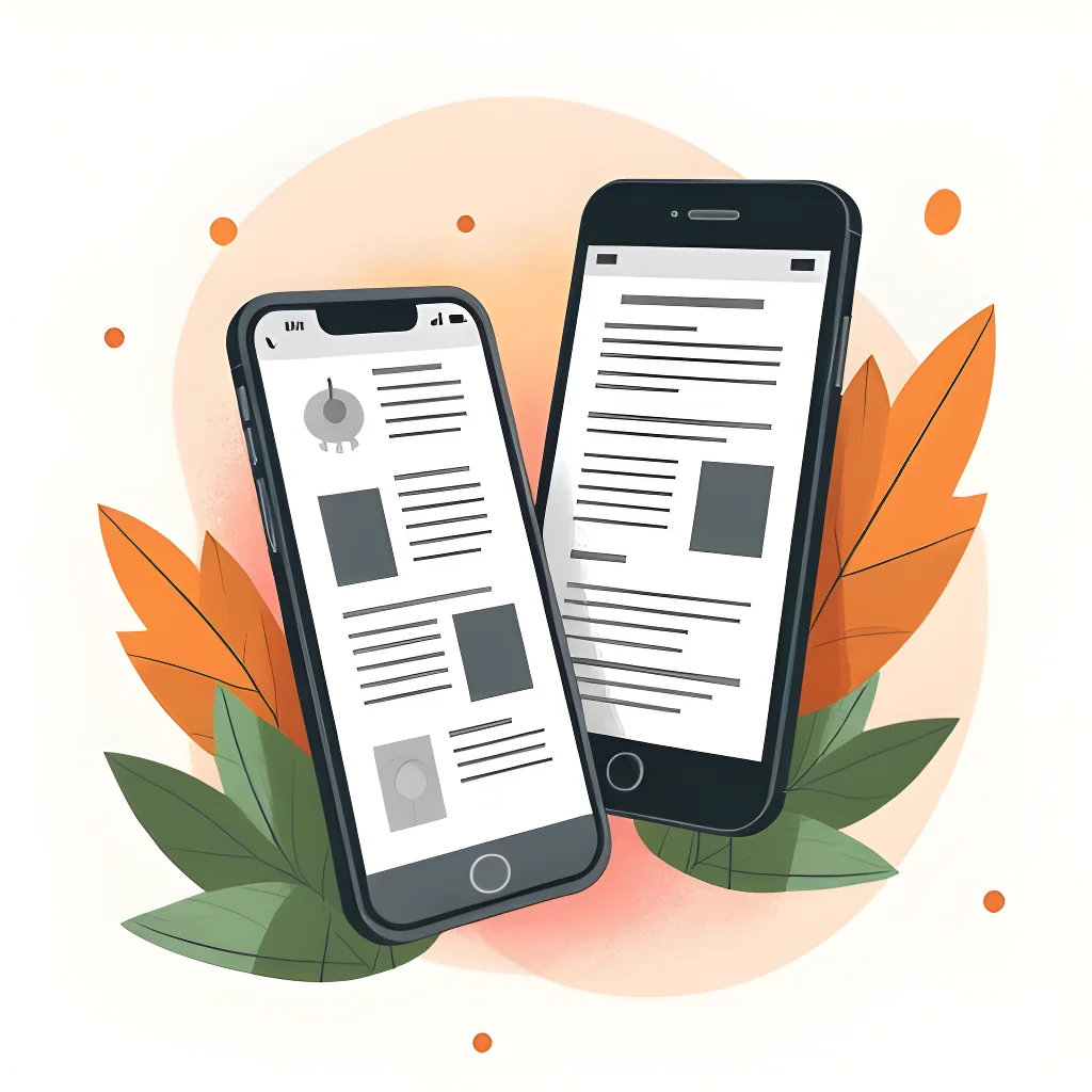
Mobile-responsive email design refers to creating emails that automatically adjust their layout, content, and visual elements to provide an optimal viewing experience across a wide range of devices and screen sizes. Unlike static emails that maintain a fixed layout regardless of where they’re viewed, responsive emails use CSS media queries and flexible layouts to transform how content is displayed based on the recipient’s device.
Why Mobile-Responsive Design Matters?
- Mobile dominance: Almost every report on email open rates concludes that mobile is responsible for at least 50% of all opens
- Higher conversion value: Mobile email traffic is often more valuable than desktop clicks, with some studies showing conversion rates up by as much as 70% for mobile email
- User expectations: Modern consumers expect seamless experiences across all their devices
- Improved engagement: Properly optimized mobile emails can increase click-through rates by 15-20%
- Brand perception: Poor mobile experiences can damage your brand reputation and reduce customer engagement
Useful Articles:
Mobile-First Email Design Approach
Start With Mobile Layouts
The mobile-first approach means exactly what it sounds like-designing for the smallest screen first, then progressively enhancing the design for larger screens. This strategy forces you to prioritize content and ensures the mobile email experience is excellent from the start.
When you begin with mobile in mind, you naturally:
- Focus on essential content: You’ll prioritize what truly matters when space is limited
- Create cleaner designs: Mobile designs tend to be simpler and more focused
- Improve load times: Mobile-optimized emails typically load faster
- Enhance readability: Content designed for small screens tends to be more concise and scannable
Starting with mobile design is much easier than trying to cram a desktop-optimized design into a mobile phone. The constraints of mobile design help create a more focused message that works well across all devices.
Responsive Templates
Using responsive email templates is one of the simplest ways to ensure your emails look great on all devices. These templates automatically adjust their layout and content to best fit the user’s device, from smartphones to tablets to desktops.
When selecting a responsive template:
- Choose one that aligns with your brand style
- Ensure it’s tested across major email clients
- Look for templates with customization options
- Verify that it includes mobile-friendly features like larger touch targets and appropriate font sizes
Most email marketing platforms offer a selection of responsive templates, making it easy to implement this best practice without extensive coding knowledge.
Optimizing Layout For Mobile Devices
Single-Column Layout
A single-column layout is the simplest and most reliable way to create a mobile-friendly email. This approach works well across all email clients and avoids many layout headaches associated with multi-column designs.
Benefits of single-column layouts include:
- Improved readability: Content flows naturally in a vertical format
- Easier navigation: Users can simply scroll down without having to navigate horizontally
- Better rendering: Less chance of layout breaking across different email clients
- Simplified design process: Easier to create and maintain
For optimal results, keep your email width between 600-640 pixels. This width works well for most email clients and mobile devices while still looking good on desktop.
Content Hierarchy
Establishing a clear content hierarchy is crucial for mobile emails. With limited screen space, users should be able to quickly scan your email and understand the main message.
To create an effective content hierarchy:
- Place important content at the top: The most critical information should appear above the fold
- Use different font sizes: Create visual distinction between headings, subheadings, and body text
- Incorporate visual cues: Use color, spacing, and design elements to guide the eye
- Maintain consistent styling: Keep styling consistent with your brand guidelines
Using different font sizes, bold text, and numbered lists helps maintain content hierarchy. This enables readers to visualize the message according to your narration and guides them through the content funnel for a more focused reading experience.
White Space Utilization
White space (or negative space) is the empty area between elements in your email design. Far from being wasted space, it’s a powerful design tool that improves readability and visual appeal.
Effective use of white space:
- Improves readability: Gives content room to breathe
- Enhances focus: Helps important elements stand out
- Reduces cognitive load: Makes information easier to process
- Creates visual elegance: Makes designs look more professional
Open white spaces are your ally in mobile email optimization. By simply allowing your content to breathe, you improve readability and visual appeal, preventing viewers from getting distracted by information overload.
Useful Articles:
Text And Typography Best Practices
Font Size And Readability
Font size plays a crucial role in the readability of your mobile emails. Text that’s too small forces users to zoom in, creating a frustrating experience.
Follow these guidelines for optimal readability:
- Body text: Minimum 14px, preferably 16px or 18px
- Headlines: 22-24px or larger
- Subheadings: 18-20px
- Button text: 16px minimum
In addition to size, consider these typography best practices:
- Use web-safe fonts: Stick to fonts that render well across all devices (Arial, Verdana, Georgia, Times New Roman)
- Limit font varieties: Use no more than 2-3 font families in a single email
- Maintain sufficient contrast: Ensure text stands out clearly against its background
- Avoid all caps: They’re harder to read and can come across as shouting
Remember that different email clients may render fonts differently, so always test your emails across multiple platforms.
Subject Line And Preheader Optimization
Your subject line and preheader text are the first things recipients see, making them critical components of your mobile email strategy.
For subject lines:
- Keep it concise: Aim for 25-30 characters to ensure visibility on mobile devices
- Front-load important words: Put the most critical information at the beginning
- Use action-oriented language: Encourage opens with compelling verbs
- Consider personalization: Include the recipient’s name when appropriate
For preheader text:
- Complement the subject line: Add context or additional information
- Keep it brief but informative: Aim for 40-100 characters
- Include a call to action: Encourage recipients to open the email
- Avoid repetition: Don’t simply repeat the subject line
Remember that 47% of email recipients open an email based on the subject line alone, while 69% report emails as spam based solely on the subject line. Crafting compelling, mobile-friendly subject lines is essential for improving open rates.
Content Brevity And Scannability
Mobile users typically scan content rather than reading it word for word. Creating scannable content improves engagement and increases the likelihood that your message will be understood.
To make your content more scannable:
- Use short paragraphs: Limit paragraphs to 2-3 sentences
- Incorporate bullet points: Break up information into digestible chunks
- Include subheadings: Create clear sections within your content
- Highlight key points: Use bold text to emphasize important information
- Create clear sections: Use dividers or spacing to separate different topics
Avoid large blocks of text, as no one wants to read a wall of text on their phone (or even on their desktop). Breaking up your text improves readability and makes your content more engaging.
Call-To-Action Optimization
Button Size And Placement
Your call-to-action (CTA) buttons are perhaps the most important interactive elements in your email. On mobile devices, they need to be large enough to tap easily with a finger.
For optimal mobile CTA buttons:
- Size: Make buttons at least 44×44 pixels (Apple’s recommended minimum tap target size)
- Padding: Include ample space around buttons to prevent accidental taps
- Placement: Position CTAs where they’re easily visible, ideally above the fold
- Contrast: Use colors that stand out from the rest of the email
- Quantity: Limit the number of CTAs to avoid overwhelming recipients
Large, prominent buttons with clear labels make it easy for mobile users to take action without frustration. Remember that most mobile users navigate with their thumbs, so design with this in mind.
Clear And Compelling CTAs
Beyond size and placement, the content of your CTA matters tremendously. Effective CTAs clearly communicate what will happen when users click and motivate them to take action.
To create compelling CTAs:
- Use action verbs: Start with strong verbs like “Get,” “Shop,” “Download,” or “Join”
- Create urgency: Words like “Now,” “Today,” or “Limited Time” encourage immediate action
- Be specific: Clearly state what users will get (“Download Your Free Guide” vs. “Click Here”)
- Keep it concise: Aim for 2-5 words that pack a punch
- Test different variations: A/B test different CTA text to see what resonates with your audience
Not using tiny text links for your primary call to action is crucial. Use a contrasting background color for your CTA buttons to make them stand out and drive more clicks.
Useful Articles:
Image Optimization For Mobile
Responsive Images
Images often make up a significant portion of email content, making their optimization crucial for mobile-responsive design. Responsive images automatically adjust their size based on the device’s screen width.
Best practices for responsive images include:
- Use percentage-based widths: Set image widths to 100% to ensure they scale with the container
- Specify max-width: Prevent images from becoming too large on desktop
- Maintain aspect ratios: Ensure images don’t become distorted when resized
- Consider retina displays: Use images with sufficient resolution for high-density screens
- Test across devices: Verify that images render correctly on various screen sizes
Implementing these practices ensures your images look great regardless of where they’re viewed.
Alt Text And Image Loading
Not all email clients automatically display images, and some users disable image loading to save data. Proper alt text ensures your message gets across even when images aren’t visible.
For effective image handling:
- Always include alt text: Describe the image content and any text contained within images
- Keep alt text concise: Aim for brief but descriptive text
- Don’t repeat information: Avoid redundancy with surrounding text
- Consider styled alt text: Some email clients support styling alt text for better appearance
- Design with images-off in mind: Ensure your email makes sense even without images
Additionally, optimize image file sizes to improve loading times, especially for mobile users who may have slower connections or data limitations. Compress images appropriately without sacrificing quality.
Testing And Optimization
Cross-Device Testing
One of the biggest pitfalls in mobile-friendly email marketing is assuming that an email looks the same across all devices. Even minor differences between iOS and Android or between various email apps can affect how your message displays.
For thorough cross-device testing:
- Test on actual devices: Whenever possible, view your emails on real smartphones and tablets
- Use testing tools: Utilize email testing platforms that show previews across multiple devices and clients
- Check major email clients: Test in Gmail, Outlook, Apple Mail, and Yahoo Mail at minimum
- Verify responsive behavior: Ensure elements stack correctly and maintain proper proportions
- Test interactive elements: Confirm that buttons and links are easily tappable
Remember that testing isn’t a one-time task-it should be part of your regular email workflow for every campaign.
A/B Testing For Mobile Optimization
A/B testing allows you to compare different versions of your emails to see which performs better with your audience. For mobile optimization, consider testing:
- Subject line length: Compare short vs. medium-length subject lines
- Preheader text: Test different approaches to this valuable real estate
- CTA button size and color: Determine what drives the most clicks
- Image-to-text ratio: Find the right balance for your audience
- Single-column vs. multi-column layouts: See which performs better on mobile
When conducting A/B tests for mobile optimization, isolate one variable at a time and ensure you have a large enough sample size for statistically significant results.
Advanced Mobile-Responsive Techniques
Dark Mode Support
Dark mode has gained significant popularity, with many users enabling it to reduce eye strain and improve visibility in low-light environments. Supporting dark mode in your emails ensures a good experience for these users.
To optimize for dark mode:
- Use transparent images: This allows them to adapt to both light and dark backgrounds
- Test color inversions: See how your design looks when colors are inverted
- Add specific CSS: Include code that targets dark mode specifically
- Maintain sufficient contrast: Ensure text remains readable in both modes
- Use vector images when possible: They adapt better to color scheme changes
Adding dark mode testing to your pre-send QA checklist helps ensure your emails look great regardless of user preferences.
Interactive Email Elements
Interactive elements can significantly enhance the mobile email experience, allowing users to engage with your content without leaving their inbox.
Consider incorporating:
- Accordion sections: Allow users to expand and collapse content sections
- Image carousels: Let recipients swipe through multiple images
- Hamburger menus: Provide navigation options in a compact format
- Interactive polls or surveys: Enable feedback collection directly in the email
- Add-to-calendar functionality: Make it easy to save event dates
While not all email clients support advanced interactivity, these elements can enhance the experience for users with compatible clients while gracefully degrading for others.
Accessibility Considerations
Creating accessible emails ensures that all recipients, including those with disabilities, can engage with your content. Accessibility is not just a best practice-it’s essential for reaching your entire audience.
Key accessibility considerations include:
- Semantic HTML: Use proper heading structure and semantic elements
- Sufficient color contrast: Ensure text is readable against backgrounds
- Descriptive alt text: Make images accessible to screen readers
- Logical reading order: Structure content in a way that makes sense when read aloud
- Keyboard navigation: Ensure interactive elements can be accessed without a mouse
Implementing these practices makes your emails more inclusive while often improving the experience for all users.
Implementation Strategies
Working With Email Designers
If you’re working with professional email designers, clear communication about mobile-responsive requirements is essential:
- Provide device statistics: Share data about which devices your audience uses most
- Establish priorities: Clarify which elements are most important for the mobile experience
- Set clear expectations: Define what “mobile-friendly” means for your specific needs
- Request multiple mockups: Ask to see designs for both mobile and desktop versions
- Plan for testing: Build testing time into the design process
A collaborative approach ensures that designers understand your mobile-responsive needs and can create emails that meet your specific requirements.
DIY Mobile-Responsive Design Tips
If you’re handling email design yourself, these practical tips can help you create effective mobile-responsive emails:
- Start with responsive templates: Use pre-built templates from your email service provider
- Keep designs simple: Avoid complex layouts that might break on mobile
- Use a modular approach: Build emails with stackable content blocks
- Learn basic HTML/CSS: Understanding fundamental code principles helps troubleshoot issues
- Create a mobile-first style guide: Document your mobile design standards for consistency
Remember that even simple designs can be highly effective when optimized for mobile viewing.
Integration With Email Marketing Platforms
Most modern email marketing platforms offer built-in tools for mobile-responsive design. Leveraging these platform features can simplify the process of creating mobile-responsive emails.
- Responsive templates: Pre-designed templates that automatically adjust for different devices
- Preview functionality: Tools to see how emails will look on various devices
- CSS inlining: Automatic conversion of CSS to inline styles for better email client compatibility
- Testing integrations: Connections to specialized email testing services
- Analytics: Data on which devices your subscribers are using
Mobile-responsive email design best practices are no longer optional-they’re essential for email marketing success. By adopting a mobile-first approach, optimizing layouts, text, images, and CTAs for smaller screens, and thoroughly testing across devices, you can create emails that deliver exceptional experiences regardless of where they’re viewed.
The statistics and case studies clearly show that properly optimized mobile emails drive higher engagement and conversion rates. As mobile usage continues to grow, implementing these best practices will ensure your email marketing remains effective and competitive in an increasingly mobile-centric world.