Now Reading: Email CTAs: Proven Tips for Higher Conversions (Includes 100 Examples)
-
01
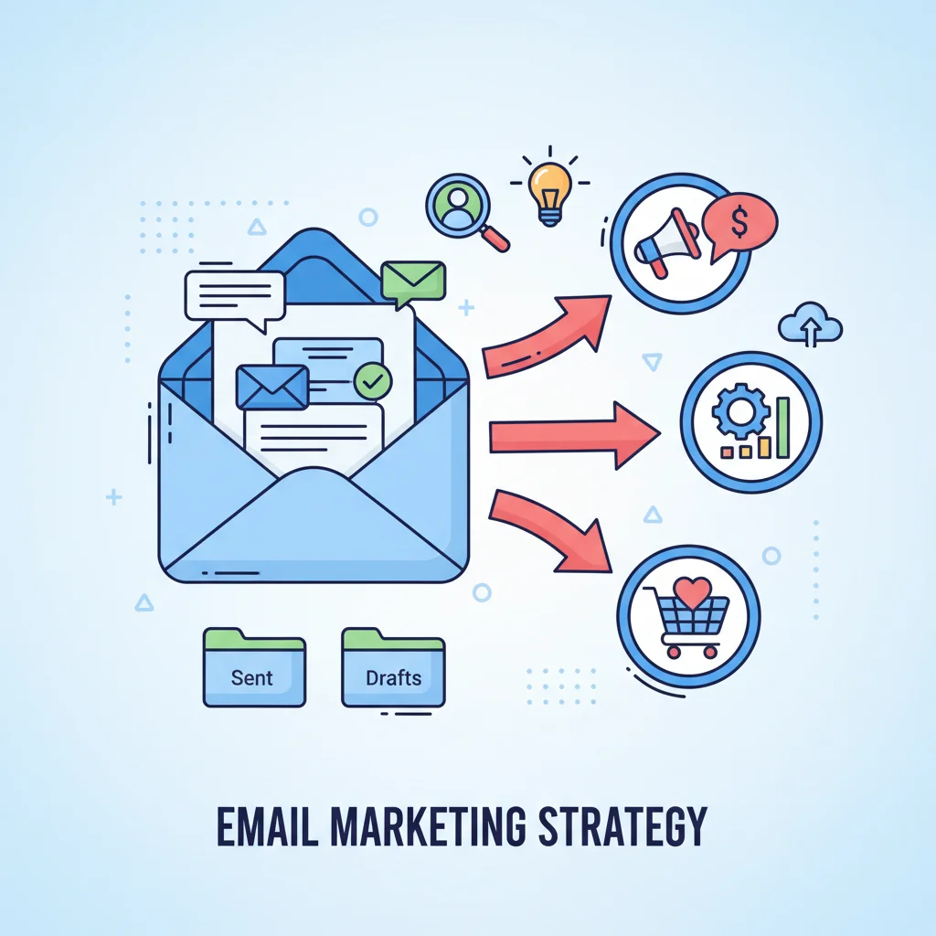
Email CTAs: Proven Tips for Higher Conversions (Includes 100 Examples)

Did you know that changing just 4 words in your email CTA can increase click-through rates by up to 90%? That’s not a typo. The difference between “Learn more” and “Get my free guide” can literally double your conversion rates. Effective email CTA creation isn’t just about button colors-it’s about psychology, placement, and persuasive copy. I’m about to share the exact formula for CTAs that convert, plus 100 examples you can swipe for your next campaign.
Key Takeaways
- Action-oriented language is crucial for high CTR – use verbs like “get,” “discover,” and “claim” instead of passive phrases
- Keep CTAs short and sweet-aim for 2-4 words that clearly communicate value
- Create urgency with words like “now,” “today,” or “limited time” to boost immediate action
- Use contrasting colors for your CTA buttons to make them visually pop in the email
- Place your primary CTA above the fold for maximum visibility
- Personalize CTAs with words like “my” and “your” to increase relevance
- Test different variations of your CTAs to find what resonates best with your audience
What Makes A High-Converting Email CTA?
I’ve spent years testing email CTAs, and I’ve found that the difference between a good one and a great one often comes down to a few key elements. High-converting CTAs aren’t just buttons-they’re strategic combinations of psychology, design, and copywriting that compel readers to take action.
The Anatomy Of An Effective CTA
An effective email CTA isn’t just slapping a “Click Here” button at the bottom of your email (please don’t do that). It’s about creating a compelling reason for your subscriber to take the next step. Here’s what makes CTAs work:
- Clear messaging that leaves no room for confusion
- Action-oriented language that tells readers exactly what to do
- Urgency triggers that encourage immediate action
- High visibility elements that stand out even when skimming
- Alignment with user intent so the CTA delivers what the reader wants
The best CTAs feel like a natural next step rather than an interruption. They should make your reader think “yes, that’s exactly what I want to do next!”
Action Words That Drive Clicks
The verbs you choose can make or break your CTA performance. Strong action words create momentum and clarity. Here are some high-performing options:
- Get (Get your free guide)
- Discover (Discover new features)
- Start (Start your free trial)
- Join (Join the community)
- Claim (Claim your discount)
- Unlock (Unlock premium content)
- Try (Try it risk-free)
Notice how these verbs feel inviting rather than demanding? They suggest benefit rather than obligation. Avoid friction words like “submit,” “enter,” or “complete” that make the action feel like work rather than a reward.
Useful Articles:
100 Email CTA Examples By Category
Let’s dive into specific examples you can adapt for your own campaigns. I’ve organized these by category so you can easily find what matches your campaign goals.
Promotional CTAs (20 Examples)
Promotional CTAs drive sales and conversions for products or services:
- “Shop now and save 20%”
- “Get your exclusive discount”
- “Claim your free shipping”
- “Unlock member pricing”
- “Grab this deal today”
- “Save 30% this weekend only”
- “Treat yourself today”
- “Score this limited offer”
- “Buy now, thank yourself later”
- “Upgrade and save”
- “Get the bundle deal”
- “Claim your bonus gift”
- “Shop the collection”
- “Add to cart”
- “Secure your discount”
- “Get it before it’s gone”
- “Snag this deal”
- “Unlock your special price”
- “Shop while supplies last”
- “Get yours now”
Educational CTAs (15 Examples)
Educational CTAs invite readers to learn more and build trust:
- “Download our free guide”
- “Watch the tutorial”
- “Get the complete checklist”
- “Access the free workshop”
- “Read the case study”
- “Get the step-by-step plan”
- “Download the template”
- “Watch how it works”
- “Get the full strategy”
- “Access your free resources”
- “Learn the system”
- “Get instant access”
- “Grab your cheat sheet”
- “See how others did it”
- “Get the complete roadmap”
Event Registration CTAs (10 Examples)
Event CTAs drive signups for webinars, workshops, and other events:
- “Save your spot now”
- “Register for the webinar”
- “Join us live”
- “Secure your seat”
- “RSVP today”
- “Get your ticket”
- “Join the masterclass”
- “Save the date”
- “Claim your spot”
- “Don’t miss this event”
Free Trial CTAs (10 Examples)
Free trial CTAs encourage product testing without commitment:
- “Start your free trial”
- “Try it free for 14 days”
- “Get started (no credit card)”
- “Test drive for free”
- “Try before you buy”
- “Experience it free”
- “Start for $0”
- “Begin your free access”
- “Activate your trial”
- “Get free access now”
Downloadable Resource CTAs (15 Examples)
Resource CTAs drive downloads of valuable content:
- “Download your free template”
- “Get the complete guide”
- “Download the checklist”
- “Get your free swipe file”
- “Download the workbook”
- “Get the PDF guide”
- “Access the toolkit”
- “Download now”
- “Get your copy”
- “Download the free resource”
- “Get instant access”
- “Grab your free download”
- “Get the complete package”
- “Download the blueprint”
- “Get your free copy now”
Personalized CTAs (10 Examples)
Personalized CTAs speak directly to the individual reader:
- “Get your custom plan”
- “See your personalized results”
- “Find your perfect match”
- “Get your custom quote”
- “Discover your options”
- “See what works for you”
- “Find your fit”
- “Get your personalized roadmap”
- “See your savings”
- “Create your account”
Social Proof CTAs (10 Examples)
Social proof CTAs leverage the wisdom of crowds:
- “Join 10,000+ subscribers”
- “See why customers love us”
- “Read success stories”
- “Join happy customers”
- “See what others achieved”
- “Join the community”
- “See customer results”
- “Read the reviews”
- “Join thousands of users”
- “See who’s using it”
Humorous CTAs (10 Examples)
Humorous CTAs use personality to drive engagement:
- “Let’s do this thing”
- “Heck yes, I’m in!”
- “Show me the goods”
- “Take my money”
- “Donut wait any longer”
- “Shop meow”
- “Let’s make magic happen”
- “Yes, I want awesome stuff”
- “Gimme the goods”
- “Let’s roll”
Best Practices For Email CTA Creation
Now that you’ve got plenty of examples, let’s talk about how to implement them effectively. These best practices will help you maximize your CTAs’ impact.
Keep It Simple And Clear
Your CTA should be instantly understandable. No one should have to think about what happens when they click your button. Here’s how to keep it simple:
- Use 2-4 words max for button text
- Make the benefit obvious
- Avoid jargon or technical terms
- Use everyday language
Remember that confusion is the enemy of conversion. If your reader has to pause to figure out what your CTA means, you’ve already lost them.
Create A Sense Of Urgency
FOMO (fear of missing out) is a powerful motivator. Adding urgency to your CTAs can significantly boost click-through rates:
- Use time-sensitive language (“today only,” “ends tomorrow”)
- Highlight limited availability (“while supplies last”)
- Show scarcity (“only 5 spots left”)
- Add countdown timers near your CTA
Urgency works because it pushes people off the fence. Without it, subscribers might think “I’ll check this out later”-and later never comes.
Use Contrasting Colors
Your CTA button should visually pop off the page. Design matters just as much as copy when it comes to getting clicks:
- Choose a button color that contrasts with your email background
- Make your button large enough to be easily clickable on mobile
- Add white space around your button to make it stand out
- Consider adding a subtle shadow or border to create dimension
The classic “button test” is simple: if you squint at your email, your CTA should still be clearly visible.
Mind The Placement
Where you put your CTA can dramatically impact its performance:
- Place your primary CTA above the fold when possible
- For longer emails, repeat your CTA throughout the content
- Put your CTA after you’ve established value, not before
- For multiple CTAs, make the primary one visually distinct
A good rule of thumb: your CTA should appear right after you’ve given the reader a compelling reason to click.
Stick To One Primary CTA Per Email
While you might include secondary CTAs, having one clear primary action will typically drive better results:
- Make your primary CTA visually dominant
- Use secondary CTAs only for related or alternative actions
- Don’t compete with yourself by offering too many options
- If you must include multiple CTAs, clearly prioritize them visually
When faced with too many choices, people often choose none. Focus your email on driving one specific action for best results.
Personalize When Possible
Personalized CTAs can increase conversion rates by making the action feel more relevant:
- Use “your” and “my” in button copy (“Get my free guide”)
- Segment your audience and customize CTAs accordingly
- Reference previous interactions when appropriate
- Tailor CTAs based on subscriber behavior
A personalized CTA feels like it was made specifically for the reader, increasing the likelihood they’ll click.
Test, Test, Test
No matter how good your CTA seems, testing is the only way to know for sure what works:
- A/B test different button colors
- Try various CTA placements
- Test different copy variations
- Compare short vs. slightly longer CTAs
What works for one audience might not work for another. Regular testing helps you continuously improve your results.
Useful Articles:
Advanced CTA Strategies
Ready to take your CTAs to the next level? These advanced strategies can help you squeeze even more conversions from your emails.
First-Person Language
Research shows that using first-person possessive pronouns (“my,” “mine”) in CTAs can increase click-through rates. Compare:
- “Download the free guide” vs. “Download my free guide”
- “Start your trial” vs. “Start my trial”
The second option in each pair creates a sense of ownership before the reader even clicks, making the action feel more personal.
Value-Focused Copy
Instead of focusing on the action, focus on the value the reader will get:
- Instead of “Subscribe now,” try “Get weekly tips”
- Instead of “Register,” try “Secure your spot”
- Instead of “Download,” try “Get instant access”
This subtle shift puts the emphasis on what the reader gains rather than what they need to do.
Interactive Elements
Adding interactive elements near your CTA can increase engagement:
- Animated buttons that respond to hover
- Countdown timers creating urgency
- GIFs that draw attention to your CTA
- Interactive quizzes that lead to a personalized CTA
These elements catch the eye and make your email more engaging, increasing the chances your CTA gets noticed.
The “Yes Ladder” Technique
This psychological technique involves getting small “yes” commitments before presenting your main CTA:
- Start with a question the reader will agree with
- Present a small, easy-to-agree-with statement
- Follow with your main CTA
For example:
“Tired of low conversion rates? (yes)
Small changes to your CTAs can double your results. (yes)
Get the complete CTA guide (main CTA)”
This technique works because people like to be consistent with their previous actions.
Design Tips For High-Converting CTAs
The visual presentation of your CTA can be just as important as the copy. Here are some design best practices:
Button Design Best Practices
- Size matters: Make buttons large enough to be easily tapped on mobile (at least 44×44 pixels)
- Shape: Slightly rounded rectangles tend to perform best
- Padding: Add plenty of padding inside the button so text isn’t cramped
- Contrast: Use a color that stands out from your email background
- States: If possible, include hover states to provide visual feedback
Mobile Optimization
With over 60% of email opens happening on mobile devices, your CTAs must be mobile-friendly:
- Use larger buttons that are easy to tap with a thumb
- Keep button text short so it doesn’t wrap on small screens
- Ensure adequate space between multiple CTAs to prevent mis-taps
- Test your emails on multiple devices before sending
A CTA that’s difficult to click on mobile will dramatically reduce your conversion rates.
Visual Hierarchy
Your email design should naturally guide the reader’s eye to your CTA:
- Use directional cues (like arrows or images of people looking toward your CTA)
- Create white space around your CTA
- Use size and color to make your CTA the most prominent element
- Ensure your CTA visually completes the story your email is telling
The path to your CTA should feel natural and intuitive, not forced or jarring.
Useful Articles:
Email CTA Checklist
Before you hit send on your next campaign, run through this quick checklist to ensure your CTAs are optimized for success:
- Is your CTA copy action-oriented and clear?
- Does your button visually stand out from the rest of the email?
- Is your CTA positioned logically within your email flow?
- Is the button large enough to be easily clicked on mobile?
- Have you tested your CTA on multiple devices and email clients?
- Does your CTA deliver on the promise made in your email copy?
- Is your landing page consistent with your CTA messaging?
- Have you limited yourself to one primary CTA?
- Does your CTA create a sense of urgency or value?
- Have you considered A/B testing different versions?
Addressing these questions will help ensure your CTAs are set up for maximum performance.
I’ve shared tons of effective email CTA creation tips that can transform your click-through rates overnight. The key is to combine compelling copy with strategic design and placement. Start by implementing one or two changes to your existing CTAs, then gradually incorporate more advanced techniques as you see what works for your audience. Remember that the perfect CTA balances clarity, urgency, and value-giving your subscribers a reason to click now rather than later.